

Posted by Half Price Banners on Apr 21st 2021
How to Design Vinyl Banners
Best Practices for Banner Design, Composition and Color
When making your own custom banner, there are a few basic rules you should follow. Use this guide on how to design, organize and display your banner to make sure your next marketing campaign is a success.
Design
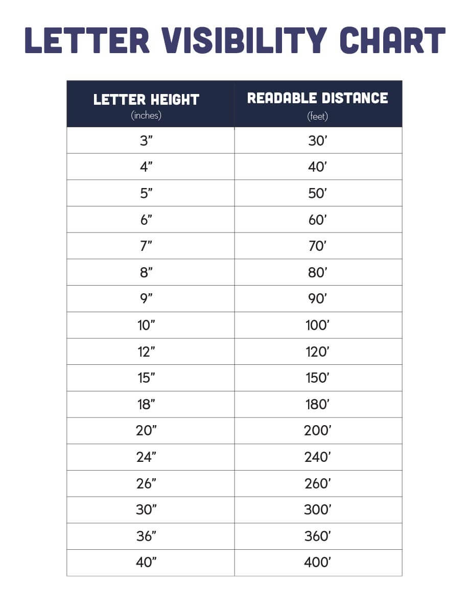
It’s important to make sure your vinyl banner is not only readable, but also highly engaging to your target audience. There are many ways to accomplish this, but here are some of the most important factors to keep in mind. First things first: decide how big you want your banner to be. You’ll need to get an accurate measurement of your available space to decide on a height and width (4’x8’? 8’x4’? — let your fence, window or wall tell you which way to go!). Also be sure to refer to a letter visibility chart for the right text/character size. As a general rule, you should try to maximize your available space without overwhelming it.
Once you’ve made your measurements and evaluated your space, you’ll know the size and orientation your banner needs to be. And if you’re still not sure you’re on the right track, reach out to one of our design consultants for some free design help.
Composition
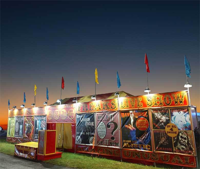
Whether you’re talking digital or out-of-home, advertisements generally have a headline, subheading, plus supporting text as necessary. Use these elements to establish a hierarchy of information and tell your reader what they need to know. The best designed banners usually have a very prominent headline (i.e. - WE DELIVER) that immediately communicates your desired message to the viewer. You can’t really go wrong with a big, center-aligned headline with supporting text below. However, if you’ve got a more complex layout in mind, make sure your elements are aligned with each other — or at the very least, balanced in a way that is pleasing to the eye.
What’s balanced? You usually know it when you see it — and when you don’t.
When designing, never feel like you need to fill every inch of your banner with clip art or text. If you throw in too much, you’re likely to overwhelm your reader. Always remember that white space can be a very powerful tool. If your banner is starting to feel cluttered, try scaling your entire design down. Giving your design more room to breathe could be the difference between adding to the noise and making a real impact with your message.
Note: If you have multiple banners in your campaign, try to use repeated elements like shapes, colors or fonts. This can be a great way to show that your signage is part of a large whole. And if your banners are part of a unified ad campaign, be sure to use common taglines (and logos!) on each one to help your audience connect the dots.
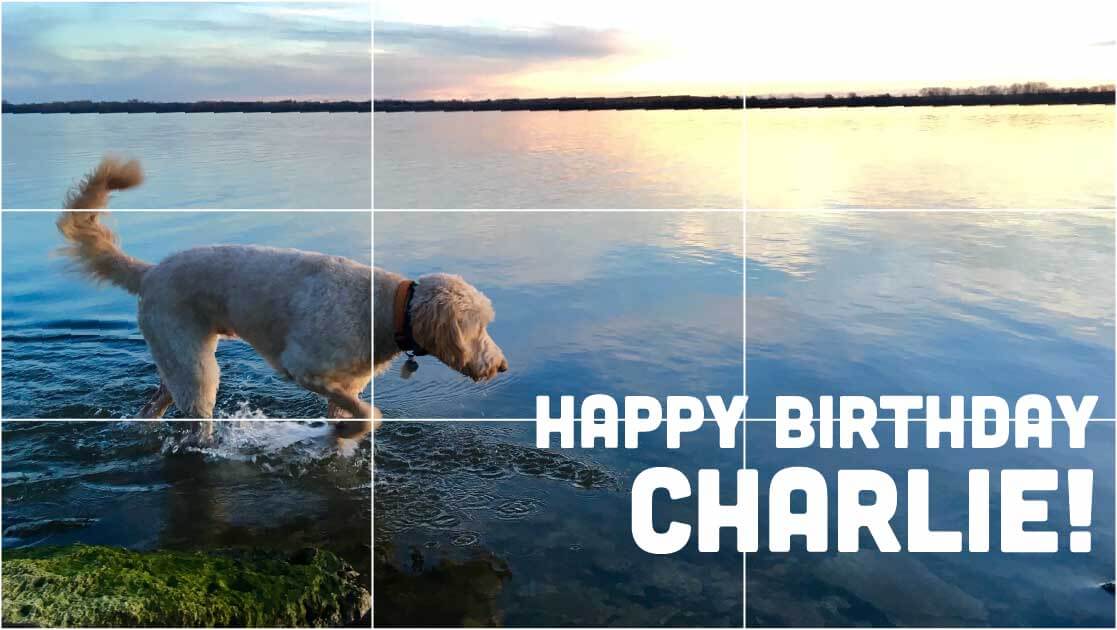
Need to add some interest to your design? Don’t forget the rule of thirds! This invisible guide divides your frame into three rows and three columns with four intersecting lines. The points where the lines intersect is where you should try to place the most important parts of your composition. This rule also allows the designer to show motion or even establish chronology within the design space.
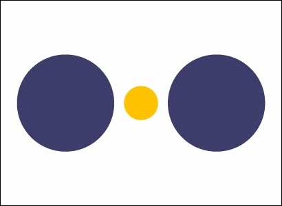
Banner Color
Color theory is a very important part of design — some might argue the most important! After all, colors are integral to how we see (and feel about) this world. For your purposes, readability should be your most pressing concern. If you want to keep things simple, start with neutral colors plus one vibrant color to stand out and draw attention to the focal point of your design.

When it comes colors, there are three main components
- Hue
- Saturation
- Value
Hue could be understood as another way to say color, while saturation refers to the intensity of color. Value is a way of measuring how light or dark a color is.
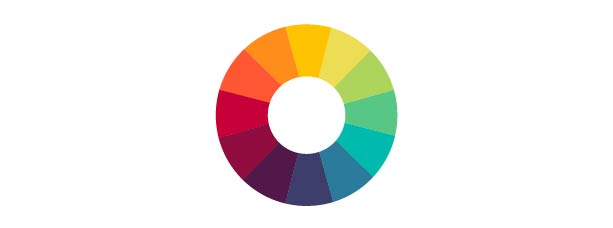
Remember this from art class? When it comes to selecting the best colors for your banner, the color wheel is your best friend. Here are a few ways to find the right ones for your design.
- Analogous: colors next to each other on the color wheel
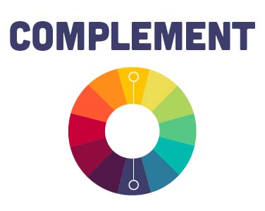
- Complement: colors on opposite sides of the wheel that are high contrast (i.e. - yellow and blue)
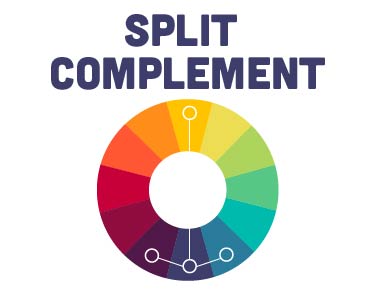
- Split complement: colors on either side of the complementary color
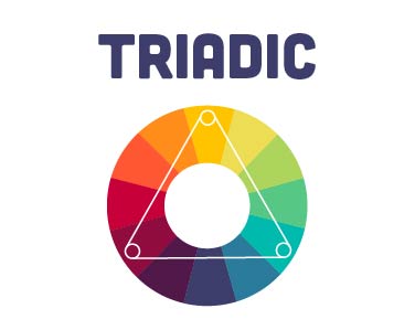
- Triadic: three colors that form a triangle on the wheel and are equidistant
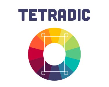
- Tetradic: four colors that form a rectangle on the wheel

Check out this nifty color tool from Adobe for a quick way to select colors for your design. Applying some basic color science to your banner could help prevent you from selecting colors that vibrate or flat-out don’t go together. If you’re having trouble with contrast, try adjusting the lightness, darkness or saturation and see if visibility improves.
Color Psychology
Color psychology, or how we emotionally process colors, is also an important part of your design and marketing. Bright colors like yellow or orange, for example, are great for drawing attention and give your design a more modern vibe, while a deep blue could be a good way to try to establish trust and stability. Here’s a quick (and very general guide) to color psychology and how most people process the colors they see.
- Blue: security, trust, peace
- Green: eco-friendly, money, freshness
- Yellow: optimism, cheerfulness, playfulness (or caution!)
- Purple: luxury, creativity, wisdom
- Pink: romance, beauty, tenderness
- Red: impulse, boldness, action
- Orange: youth, energy, excitement
Start Your Design Today
There’s a reason we have so many five-star reviews: we make DIY advertising easy and affordable for businesses and organizations of all sizes! Join thousands of satisfied customers and make your own custom vinyl banner today.
